

why so difficult?
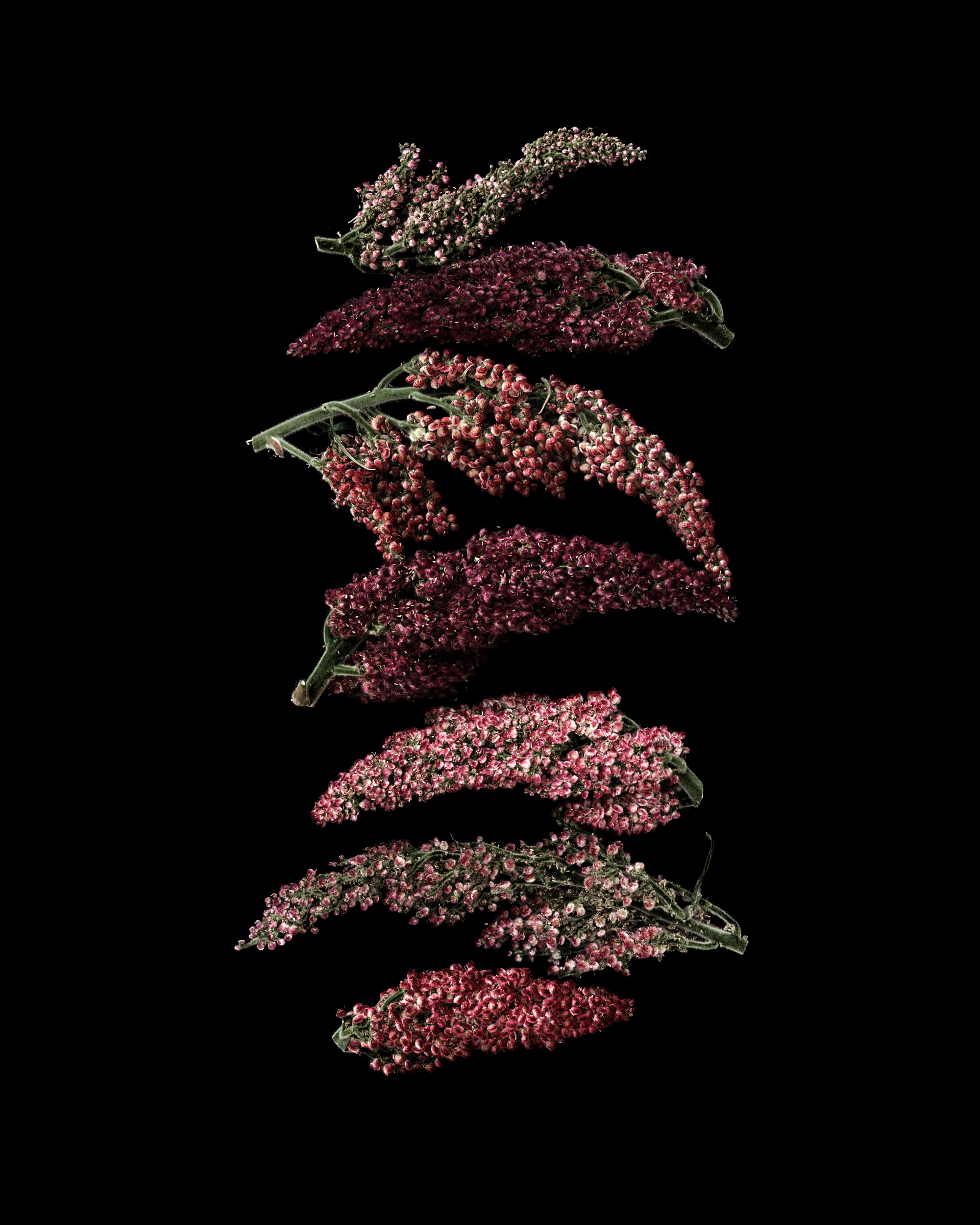
My plan was to remove the fruit clusters from the tops of yesterday’s stems, and make an simple arrangement with them. On my kitchen counter, all the colors looked so natural and harmonious together, I thought it would be easy-peasy. It was not easy-peasy. I was at it all afternoon. The clusters looked shaggy, not interesting. The colors looked more interesting in natural light than they did on the images. Nothing I tried seemed to work. It’s not often I wrestle with a subject for as long as I did with these staghorns trying to make a composition work. After all these years, I still get stymied.
Also, I think there is something about photographing red and trying to get it to stay “natural” on the edited image that might have been the problem. I say this because my book publisher flagged one of my images during the publishing process as having an unnatural red–I forget now what she called it, but she was right, it had gotten over brightened and looked artificial. Any graphic designers out there who can help me understand this and how to avoid it?
sumac staghorn fruit clusters
