

classical composer series, collage no. 1 Beethoven
This series was inspired by the iconic concert posters produced in the 1940s by Swiss graphic designer Josef Müller-Brockmann.
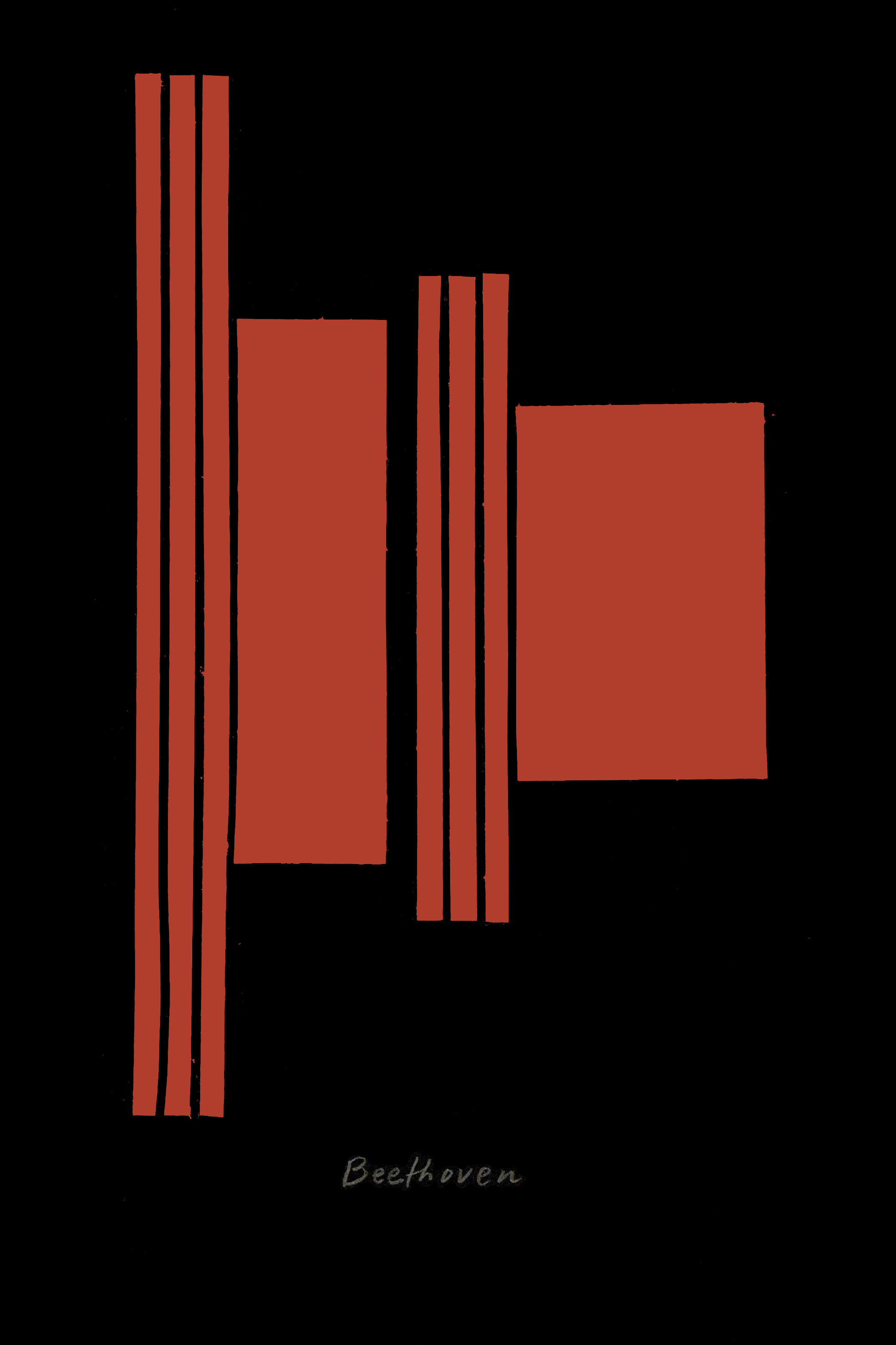
I picked the most memorable few measures (usually near the beginning) of six familiar pieces of classical music and made them visual using simple shapes and color. Each bar represents a single note. The color of each collage is meant to reflect the overall mood or emotion or energy of the musical composition it imitates. The width of each bar is correlated with the note’s value, or duration, and the bar’s height corresponds to its relative pitch. A taller bar would represent a higher note, and a shorter bar a lower note. A wider bar would last longer, and a narrower bar would be held for a shorter time. I did not try to create an exact 1:1 correlation of music on the staff to visual representation on the page. In some cases it was more effective to give a note greater visual impact than its actual musical duration, as a way of conveying the note’s weight or emotion, but in general, the results are not particularly obscure or difficult to decipher. Anyone who knows these pieces, should be able to piece together the melody. Take a look, and see if you can hear the pieces in your head. If you can, than I have succeeded.
The key code is provided below. But see if you can’t guess which work is represented first.
STILL collage project 2017 | Week 22 (mary jo hoffman)
Green: The Four Seasons: Spring, by Vivaldi
Red: Symphony #5, by Beethoven
Beige: William Tell Overture, by Rossini
Blue: Rhapsody in Blue, by Gershwin
Yellow: Eine Kleine Nachtmusik, by Mozart
Purple: Toccata and Fugue in D Minor, by Bach
